
|
|
|
|
| Home | Introduction | The Team | Back-end | Cellphone Interface | Web Interface | Downloads |
 By Marc Pelteret |
|||
|
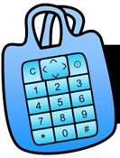
The Web and cellphone interfaces allow users to view and manipulate their lists and various other features of the system. In addition to this, the Web interface is the starting point for new users, who must use it to sign up for the service and create and set up their lists.
The aim was to create an interface that is interactive and simple and quick to use. To do this, the AJAX Web development technique was used. + About AJAX About AJAXAJAX is not a technology; it is, in fact, several technologies that have been grouped together to form an approach to Web application development. As Jesse James Garrett explains, it incorporates:
Classic Web applications are based on a multi-page interface model. In this model (left), a user action on a Web page triggers an HTTP request, which is sent back to the server. The server performs some actions based on this request and then returns a Web page to the client, which replaces the original page with the one it was sent. AJAX uses a different model (right), namely that of a single-page interface. When the user triggers an event that leads to communication with the server, rather than re-loading the entire page to display the results of that interaction, changes are made to elements within the page. In this way the user's interaction with the Web application is asynchronous – it is independent of communication with the server. The core reason for AJAX coming into being is interactivity, which is closely associated with usability. An increased level of interactivity has positive effects on a user's perceived satisfaction, effectiveness, efficiency, value and overall attitude towards a Web site. Some example Web sites that use AJAX:
Design and ImplementationThe following are the system's major features:
A simple prototype was built to test the technologies to ensure that they were adequate for the project and to get an idea of how they work. It also served to demonstrate an idea that wouldn't work. The initial plan was to make use of the drag-and-drop functionality provided by the Yahoo! Toolkit. However, while creating the prototype it was discovered that the interface became very slow when the drag-and-drop list contained a large number of items. There were three rounds of design interviews during the project. Each session was highly constructive and yielded many good ideas that were used in the project. The first round was user requirement gathering, where users were interviewed to determine what they required and wanted to see in a system like Cellphone Shopper. From these interviews and team brainstorming, list of features that would be included in the system was drawn up. The cellphone and Web interfaces were then constructed. In order to test the interface designs, a focus group was organised – the second round of interviews. The group consisted of four volunteer Computer Science students, two from Masters and two from Honours, each with interaction design training. The idea was to have a group of "experts" scrutinise and critique the interfaces. The designs the group was shown were low fidelity paper prototypes which were drawn in Microsoft Visio. The cellphone and Web interfaces were constructed over the three weeks following the second design interview. A third design interview was then organised to evaluate the results. Again, four "experts" evaluated the system. The Web interface that was presented was an interactive "shell". Most of the core pages were implemented and their major interface elements were present and could be interacted with. For instance, on the My Reminders screen the user could use a form to add a reminder and its details would be listed on the screen; this reminder could then be edited and its details would be updated on the screen immediately. The site had no back-end connectivity. EvaluationThe Web interface was evaluated through user testing and heuristic evaluation.The user testing was a direct observation evaluation, which yielded qualitative results. The users who were involved in the evaluation fell into one of three classes: 1. The interface "experts" who had been involved in the design phases earlier in the project. 2. People who are knowledgeable of computers and technology. 3. People who are considered computer novices. Eight users evaluated the system: three from the first class, two from the second and two from the third. The users were asked to perform a series of tasks and the author observed them, noting any problems they had while performing the tasks, as well as any faults that they discovered in the system. As they performed the tasks, they were also asked to interpret the system's feedback – for instance, what certain icons mean. Before the actual evaluation began a pilot study was performed using two people. The aim to was to check that the users would understand what was being asked of them in the evaluation. The pilot study led to several changes to the evaluation questions and how the evaluation was performed. Heuristic evaluation is a technique created as a way of structuring expert evaluation of an interface. The idea is that the experience of interface designers is condensed into a number of design heuristics against which the interface is evaluated by a usability expert. It was created by Jakob Nielsen, who proposed 10 general heuristics. During the evaluation, the expert examines the system and rates each heuristic using Nielsen's severity ranking scale. Three users performed individual heuristic evaluations. All of them are Computer Science students; two are PhD students and third is a second-year Masters student. All three are working on projects that revolve around usability. They used Nielsen's heuristics and ranking scale in their evaluations. As is to be expected, some users had more trouble using the interface than others. However, there were several problems that repeatedly cropped up. Some examples include: The interface does not convey that it is communicating with the server and waiting for a response. This, and the fact that there was often a delay during this communication, meant that many of these users believed that they had not pressed a button or done something properly, and clicked the button again or began to re-do the operation. The "Add a new reminder" form has a field with the label "Name:". Several users mistook this to mean their name, rather than the name of the reminder. Some users tried to edit the date field of the "Add a new reminder" form, rather than use the calendar (accessed through the button beside the field) to select a date. The shop layouts screen was a big problem. The description text generally was not understood. The user testing also uncovered a number of bugs, though none caused the system to be unusable. Both sets of evaluators were happy with the interface on the whole. Most of them liked its visual design and thought it generally functioned well. ConclusionsThe project proposal stated that I had two sets of tasks: To design and implement the Web-based end-user interface To perform user evaluations of the interface Both have been done over the span of the project.The proposal also listed the following as the key success factors for the Web interface: The features specified for the system are fully implemented and function properly. Users consider the interface to have good aesthetics and be easy to use. The interface has good performance and can bear an acceptable workload. The majority of the key features proposed for the system as whole have been implemented. In addition to the proposed core features, several suggested by the users and evaluators were implemented. The Web interface is by no means perfect, as the evaluations showed. Nor is it entirely bug free. However, its implementation is largely successful. Evaluations showed that most of the interface is easy to use and many of the evaluators commented on its good aesthetics. Finally, though not thoroughly tested, the interface appears to perform well. Server delays are the only performance problem, and this could most likely be rectified by moving the back-end and interface on to a server outside of the UCT network. > Show All Sections < Hide All Sections |
|||
| Home | Introduction | The Team | Back-end | Cellphone Interface | Web Interface | Downloads | |||
Cellphone Shopper, a 2007 University of Cape Town Computer Science honours project 

|


")